Visualization and Interaction
Sankey Diagrams
Requirements
- jupyter notebook
- ipysankeywidget
Example
Code in this section uses the CE solar model
from solar import Mission
M = Mission(latitude=[20], sp=False)
M.cost = M.solar.Wtotal
del M.substitutions[M.solar.wing.planform.tau]
sol = M.solve("mosek")

from gpkit.interactive.sankey import Sankey
Sankey(M).diagram(M.solar.Wtotal)

(objective) adds +1 to the sensitivity of Wtotal_Mission/Aircraft
(objective) is Wtotal_Mission/Aircraft [lbf]

Ⓐ adds +2.71 to the overall sensitivity of Wtotal_Mission/Aircraft
Ⓐ is Wtotal_Mission/Aircraft <= 0.5*CL_Mission/FlightSegment/AircraftPerf/WingAero*S_Mission/Aircraft/Wing/Planform.2*V_Mission/FlightSegment/FlightState**2*rho_Mission/FlightSegment/FlightState

Ⓑ adds -3.71 to the overall sensitivity of Wtotal_Mission/Aircraft
Ⓑ is Wtotal_Mission/Aircraft >= W_Mission/Aircraft/Battery + W_Mission/Aircraft/Empennage + W_Mission/Aircraft/Motor + W_Mission/Aircraft/SolarCells + W_Mission/Aircraft/Wing + Wavn_Mission/Aircraft + Wpay_Mission/Aircraft
Explanation
Sankey
diagrams can be used to
visualize sensitivity structure in a model. A blue flow from a constraint to its parent
indicates that the sensitivity of the chosen variable (or of making the
constraint easier, if no variable is given) is negative; that
is, the objective of the overall model would improve if that variable’s
value were increased in that constraint alone. Red indicates a
positive sensitivity: the objective and the the constraint ‘want’ that
variable’s value decreased. Gray flows indicate a sensitivity whose
absolute value is below 1e-7, i.e. a constraint that is inactive for
that variable. Where equal red and blue flows meet, they cancel each
other out to gray.
Usage
Variables
In a Sankey diagram of a variable, the variable is on the left with its final sensitivity; to the right of it are all constraints that variable is in.
Free
Free variables have an overall sensitivity of 0, so this visualization shows how the various pressures on that variable in all its constraints cancel each other out; this can get quite complex, as in this diagram of the pressures on wingspan:
Sankey(M).sorted_by("constraints", 1)

Fixed
Fixed variables can have a nonzero overall sensitivity. Sankey diagrams can how that sensitivity comes together:
Sankey(M).diagram(M.mission[0].loading[1].vgust)

Equivalent Variables
If any variables are equal to the diagram’s variable (modulo some
constant factor; e.g. 2*x == y counts for this, as does 2*x <= y
if the constraint is sensitive), they are found and plotted
at the same time, and all shown on the left. The constraints responsible
for this are shown next to their labels.
Sankey(M).diagram(M["CLstall"])

Models
When created without a variable, the diagram shows the sensitivity of every named model to becoming locally easier. Because derivatives are additive, these sensitivities are too: a model’s sensitivity is equal to the sum of its constraints’ sensitivities. Gray lines in this diagram indicate models without any tight constraints.
Sankey(M).diagram(left=60, right=90, width=1050)

Syntax
| Code | Result |
|---|---|
s = Sankey(M) |
Creates Sankey object of a given model |
s.diagram(vars) |
Creates the diagram in a way Jupyter knows how to present |
d = s.diagram() |
Don’t do this! Captures output, preventing Jupyter from seeing it. |
s.diagram(width=...) |
Sets width in pixels. Same for height. |
s.diagram(left=...) |
Sets top margin in pixels. Same for right, top. bottom. Use if the left-hand text is being cut off. |
s.diagram(flowright=True) |
Shows the variable / top constraint on the right instead of the left. |
s.sorted_by("maxflow", 0) |
Creates diagram of the variable with the largest single constraint
sensitivity. (change the 0 index to go down the list) |
s.sorted_by("constraints",
0) |
Creates diagram of the variable that’s in the most constraints.
(change the 0 index to go down the list) |
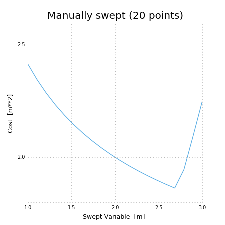
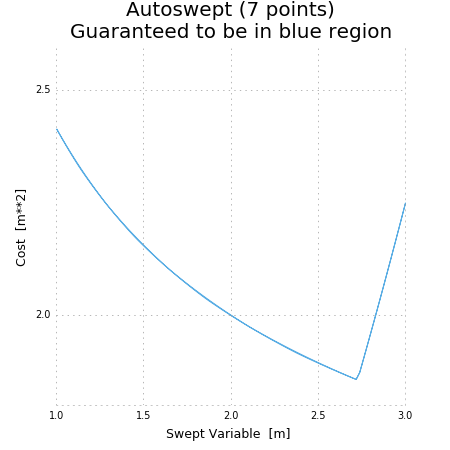
Plotting a 1D Sweep
Methods exist to facilitate creating, solving, and plotting the results of a single-variable sweep (see Sweeps for details). Example usage is as follows:
"Demonstrates manual and auto sweeping and plotting"
import matplotlib as mpl
mpl.use('Agg')
# comment out the lines above to show figures in a window
import numpy as np
from gpkit import Model, Variable, units

x = Variable("x", "m", "Swept Variable")
y = Variable("y", "m^2", "Cost")
m = Model(y, [y >= (x/2)**-0.5 * units.m**2.5 + 1*units.m**2, y >= (x/2)**2])

# arguments are: model, swept: values, posnomial for y-axis
sol = m.sweep({x: np.linspace(1, 3, 20)}, verbosity=0)
f, ax = sol.plot(y)
ax.set_title("Manually swept (20 points)")
f.show()
f.savefig("plot_sweep1d.png")

# arguments are: model, swept: (min, max, optional logtol), posnomial for y-axis
sol = m.autosweep({x: (1, 3)}, tol=0.001, verbosity=0)
f, ax = sol.plot(y)
ax.set_title("Autoswept (7 points)\nGuaranteed to be in blue region")
f.show()
f.savefig("plot_autosweep1d.png")
Which results in: